As a life-long resident of Durham, NC, I can always be heard repping my city and doing Durham related projects. Here is a rebrand I made for The American Tobacco Campus.

For the rebrand, I designed a new logo for the American Tobacco Campus, using the iconic water tower as the primary graphic.

A look at my final business card for the redesign.
Process
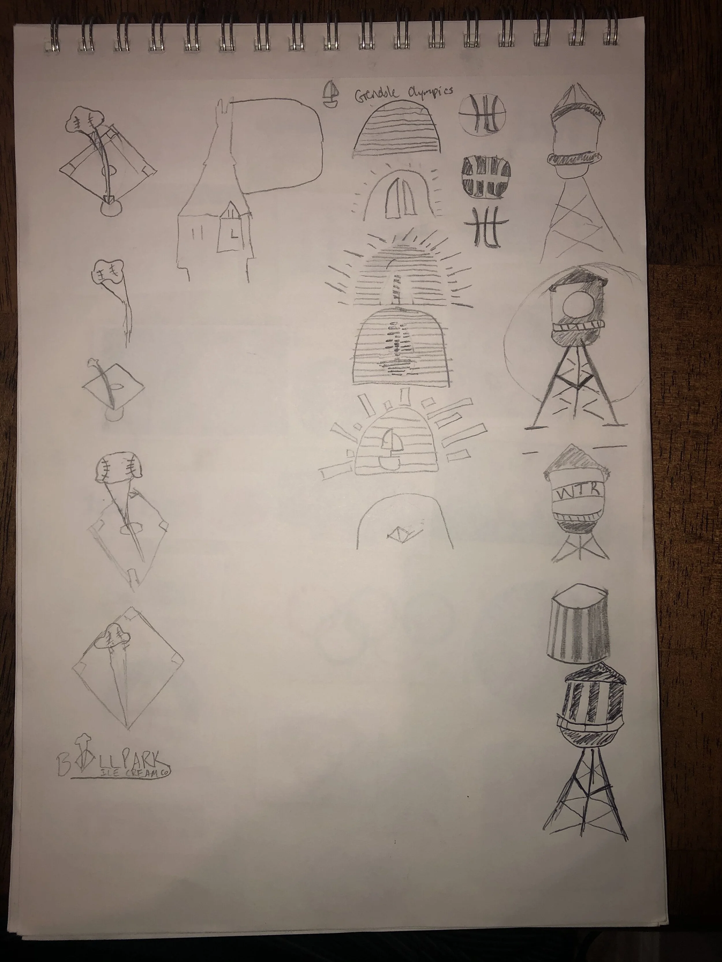
Sketches
I worked to break the water tower from previous designs of it, eventually settling on a design that emphasized negative space and accurate form.

Type Study
I worked on the text for the card trying a mix of decorative, sans serif, and serif fonts. I ultimately decided on the sans serif Mostra Nuova and the slab serif Rockwell, to balance it.

Color Study
I explored multiple different color studies for the rebrand, working to incorporate the brownish-orange color that make up the bricks of the buildings. I decided on the split complementary blue, yellow, and orange seen on the far left.

Photo by Robin McKinney